|
For this lab exercise, we used ArcGIS Pro tools to compute spatial statistics on point vector data. We were interested in identifying hot spots and cold spots so to speak in the distribution of sasquatch sightings in North America. The first statistical analysis tool was calculating the "average nearest neighbor" which determines, for each point, the average distance to its nearest neighbor. The distribution of these values helps identify if the points are randomly distributed or subject to clustering and preference. The very high z-score and effectively zero p-value indicated clustered data. 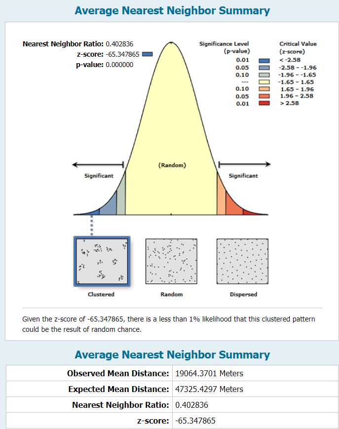 The second statistical analysis we performed was spatial autocorrelation using Moran's Index. This test is normalized on a scale of -1 to 1 and incorporates an attribute value for each point. The index determines whether there is spatial correlation of similar (or dissimilar, in the case of negative correlation) values to each other. For the sake of this exercise, we used a contrived attribute of "reliability," ranked on a scale of 1-5. The report below shows an I-value of 0.23, which represents slight correlation of similarly reliable sightings within certain areas. 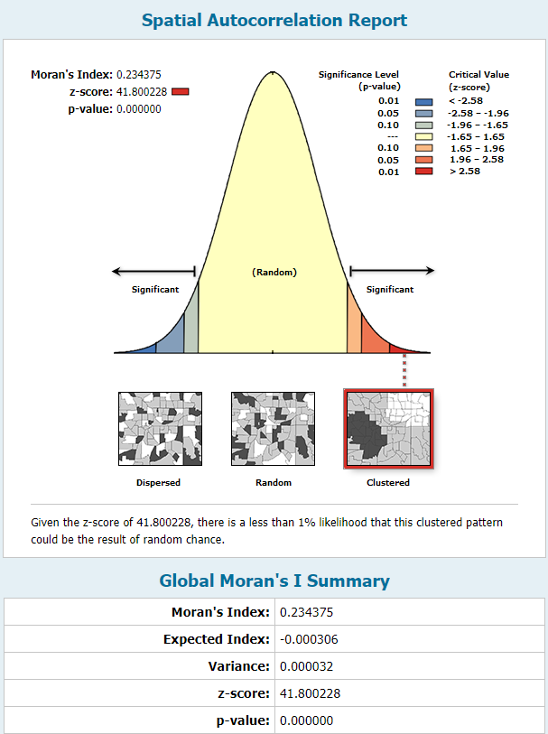 The final statistical test we conducted was the Gi* test, which uses the distribution of all values of the specified attribute to identify clusters of high values and clusters of low values. The "hotspot" values are assigned to a new set of points and a second shapefile is generated. The computation requires a user-defined search radius and the option for weighted significance based on distance between two points. I used fixed distances and compared the two results on the map below. Instead of applying the "reliability" field, I combined the sightings data with US Census Bureau county population data to create an attribute of local population density in the county of the sightings. The heat map indicates concentrated areas of sightings in densely populated areas as well as areas of clustered sightings in more rural areas. The search distance plays a significant role on the results, particularly well illustrated in the different treatment of sightings within the greater Seattle area. 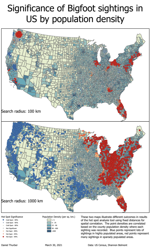 See a full-resolution PDF here
0 Comments
The objective of this exercise was to identify and analyze the home ranges of seven coyotes based on point data collected by tracking. In addition to identifying their core and general ranges, their actual use of different land cover types was analyzed and reported. 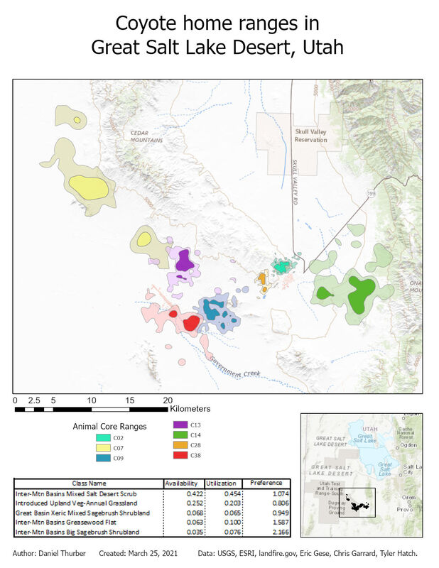 The workflow for this analysis drew upon previously-used tools such as point-polygon-raster conversions and interactions and raster reclassification. We also generated a point shapefile from a .csv file and used the kernel density geoprocessing tool to extend a probability surface to represent coyote ranges. The nature of this process explains why all of the ranges include multiple disconnected areas. The ranges shown represent areas where each animal is 50% (core range) and 95% (general range) likely be detected based on experimental data. Most significantly, this lab introduced us to automation of repetitive geoprocessing tasks using the ArcPy library in Python 3. We used a script previously developed by Chris Garrard and Tyler Hatch and applied it to our data directly through the geoprocessing toolbox. These scripts can also be executed independently in a Python console. Upon generating individual polygon files for each animal, the ranges and detection data were superimposed on land cover data to analyze what habitat was most available to the animals as a collective unit and where they were observed. The preference ratio refers to how frequently animals were observed in the given land cover compared to how much of that land cover was available. The 15 most available land cover types are reported below. 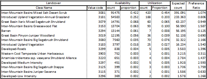 View a high-resolution PDF here.
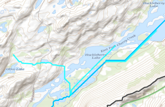
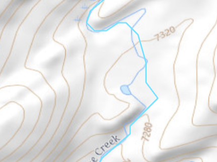
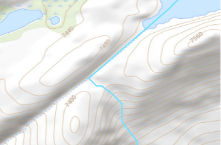
In this exercise, we delineated and characterized a stream network using ArcGIS Pro and included geoprocessing tools. Supporting the idea that a digital elevation model is the most useful application of raster data, all elements of this map were generated based on a 10m DEM from the USGS. I chose to analyze the watershed of Cherry Creek above the inflow to Cherry Reservoir in central California. We were advised to avoid lakes, which I dismissed out of curiosity to see how an abundance of lakes might impact the end result. Managing lakes put extra emphasis on the need to create a 'filled' DEM which is necessary to maintain continuity of the flow accumulator. I first processed the DEM into hillshade (shown), slope, flow direction, and flow accumulation layers. The flow accumulation layer is critical for placing the pour point, and ensuring it lies in the stream network. The pour point (just North of Cherry Lake) is used in conjunction with the flow direction raster to establish the watershed extent. Lastly, I used the flow accumulation raster to delineate the stream network and identify the stream order of each segment using the Strahler method. The outcome of the stream order calculation relies heavily on the threshold value used to classify minor watercourses as actual streams. In this case, I used the threshold of 0.8 sq km of contributing area. The threshold value establishes all points with greater than 8000 pixels of contributing area as part of the stream network. This was vetted by comparison to the US Topo ESRI base layer. This proved to be a reasonable estimation, though it is clearly not the same procedure used to generate the basemap as some "intermittent" streams were acknowledged in my analysis while "perennial" streams were missed. My analysis ignores aquifer composition, elevation, and land cover upstream, all of which can impact the potential for consistent water in a channel. 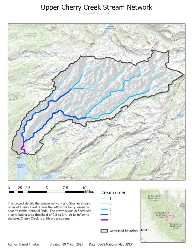 Total lengths of streams within the network are listed below. This generally follows the trend of decreasing length with increasing stream order, though the trend is not consistently geometric. 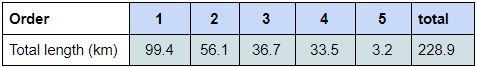 Figure 1: cumulative stream lengths for each class Throughout the geoprocessing, I noticed a handful of nuances that did not impact the integrity of the final results, but are worth noting. These oddities are described in figures 2-5 and are worth manually considering throughout the process.
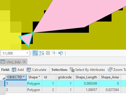
As a final consideration, I wanted to compare the outcomes of this workflow to the automated watershed delineation tool provided by USGS Streamstats. This cloud-based program allows the user to identify a pour point and immediately delineate the pour point. The results were mostly consistent with a few notable exceptions. In the image below, the purple represents area included by both techniques. Pink was only included in the GIS analysis, blue was only included in the Streamstats analysis. The total areas of the two polygons were within 2%. Stream order calculations would not have been possible with Streamstats, although a great deal of climate data is automatically connected to the project. The Streamstats polygon appeared to be created using a DEM with ~100ft pixels, so the importance of raster resolution is evident once again. 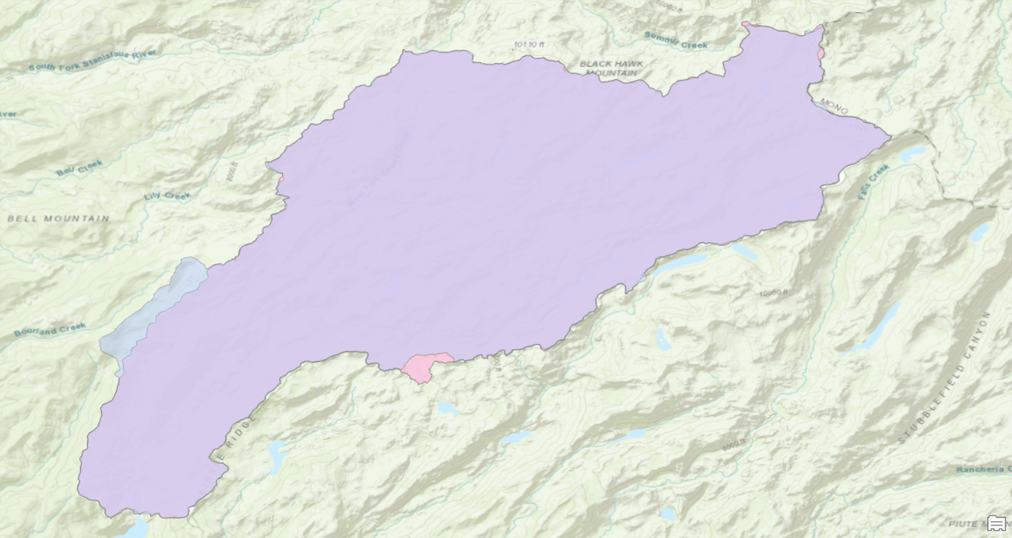 Fig. 6: Streamstats (blue) and ArcGIS Pro (pink) polygons of contributing area View a high resolution PDF here
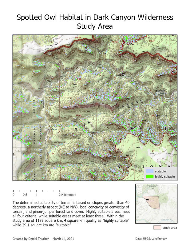
The purpose of this exercise was to identify terrain suitable for spotted owl habitat in a canyon/plateau province of southeastern Utah. To accomplish this, I performed some basic DEM geoprocessing, condense rasters through reclassification, and calculate pixel values by combining several layers. Terrain was evaluated for suitability based on four criteria:
 View a high-resolution PDF of the map here.
Following up with our previous analysis of digital elevation models, this week we went about creating DEM rasters from LiDAR point cloud data. Data from LiDAR surveys is a collection of millions of points (referred to as a point cloud) representing the elevation of the ground surface (or water surface/vegetation cover) throughout the survey area. We utilized Cloud Compare software to open and visualize the point cloud data. The data was then used to generate 1m resolution DEM grids. For any cells where no elevation points were measured, the elevation values were interpolated from different cells. The resulting grids were then displayed and processed using QGIS. QGIS is an open-source (free for most users) alternative to ESRI's ArcGIS Pro. Developing familiarity with this free alternative is useful for situations where one may not have access to more costly programs. The two maps show elevation overlaid with a hillshade layer. Note that the elevation color ramp covers the same relative relief (570 m) between the two maps. This entire range is fulfilled in the canyon near Klondike Creek, whereas the total relief near Spencer Reservoir is quite small. The absolute elevations of the two study areas are not correlated on this map. Horizontal scales of each are congruent. 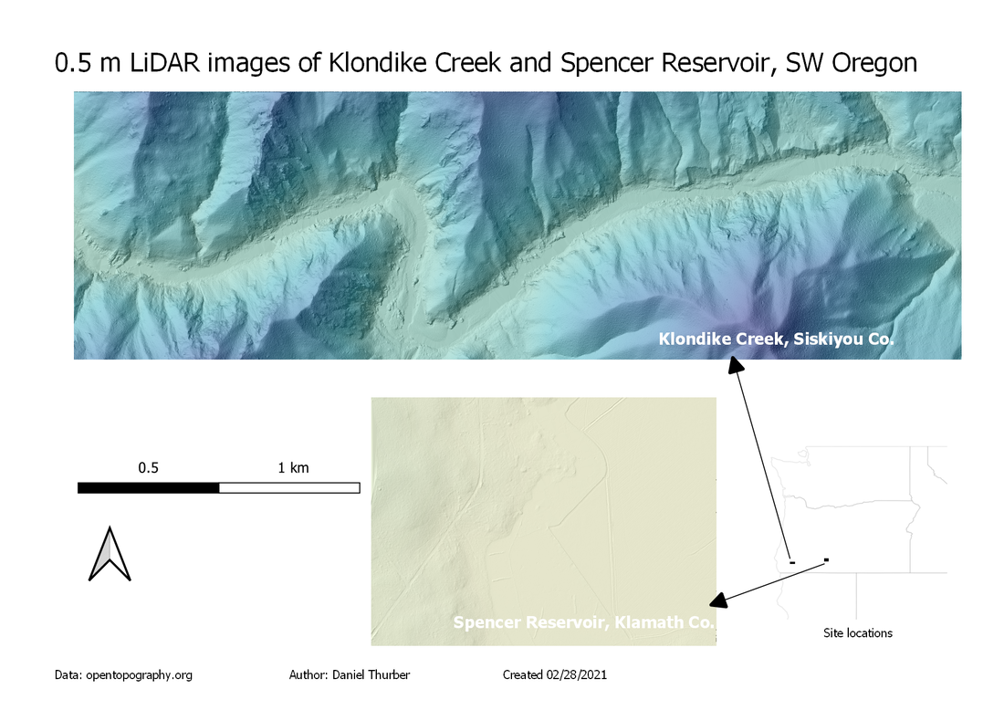 Find a full-resolution PDF here.
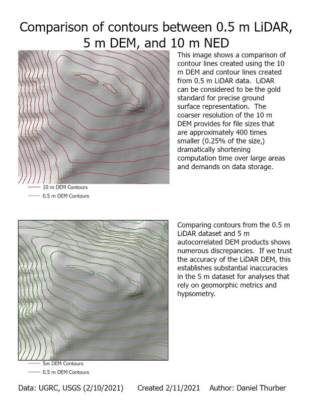
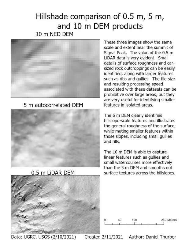
Digital elevation models (DEMs) are perhaps the most prevalent and useful applications of raster data in GIS. They represent the topography of the land surface through a gridded array of elevation points (represented as pixels). The density of these points/pixels defines the resolution of the DEM and while greater precision is fantastic, it comes at the cost of large file sizes and therefore high demands on data storage and processing speeds. Here, we compare the capacity of different sources and resolution to represent the land surface: 0.5 m LiDAR, 5 m autocorrelated, and 10 m NED DEMs. Click on each image for a high-resolution PDF of the map layout.
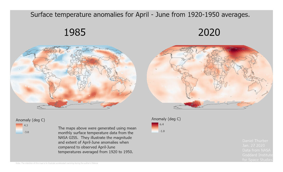 The purpose of this assignment was to perform some basic data mining from the NASA GISS site and work with NetCDF files in Arc GIS Pro and manipulate color symbology to accurately express the trends across a range of values. The primary challenge was in re-aligning the color ramp so that:
A high-resolution PDF is available here. |
Advanced GISThis page is a repository of lab exercises produced for WATS 6920 - Advanced GIS Archives
April 2021
Categories |
 RSS Feed
